Studying Customer Behavior Like a Scientist: Causal Inference for Product Teams
Why do some users churn while others become power customers? What nudges drive feature adoption? Does a UI change really cause higher conversion, or was it just good timing?
These are causal questions, and answering them well requires more than dashboards and KPIs. In public health, epidemiologists have developed rigorous study designs to answer questions about disease, treatment, and human behavior. These same principles can help product teams analyze customer behavior with scientific precision.
This article introduces causal inference through the lens of product analytics and adapts four core epidemiological study designs for tech settings, plus a foundational look at A/B testing and randomization.
Causal Inference and the Counterfactual
At the heart of causal inference is the idea of the counterfactual:
What would have happened to a user if they hadn't seen the promotion?
For each customer, we only observe what actually happened—not what could have happened under an alternative condition. This missing data problem is what makes causal inference challenging.
The goal of good study design is to approximate the counterfactual as closely as possible using available data.
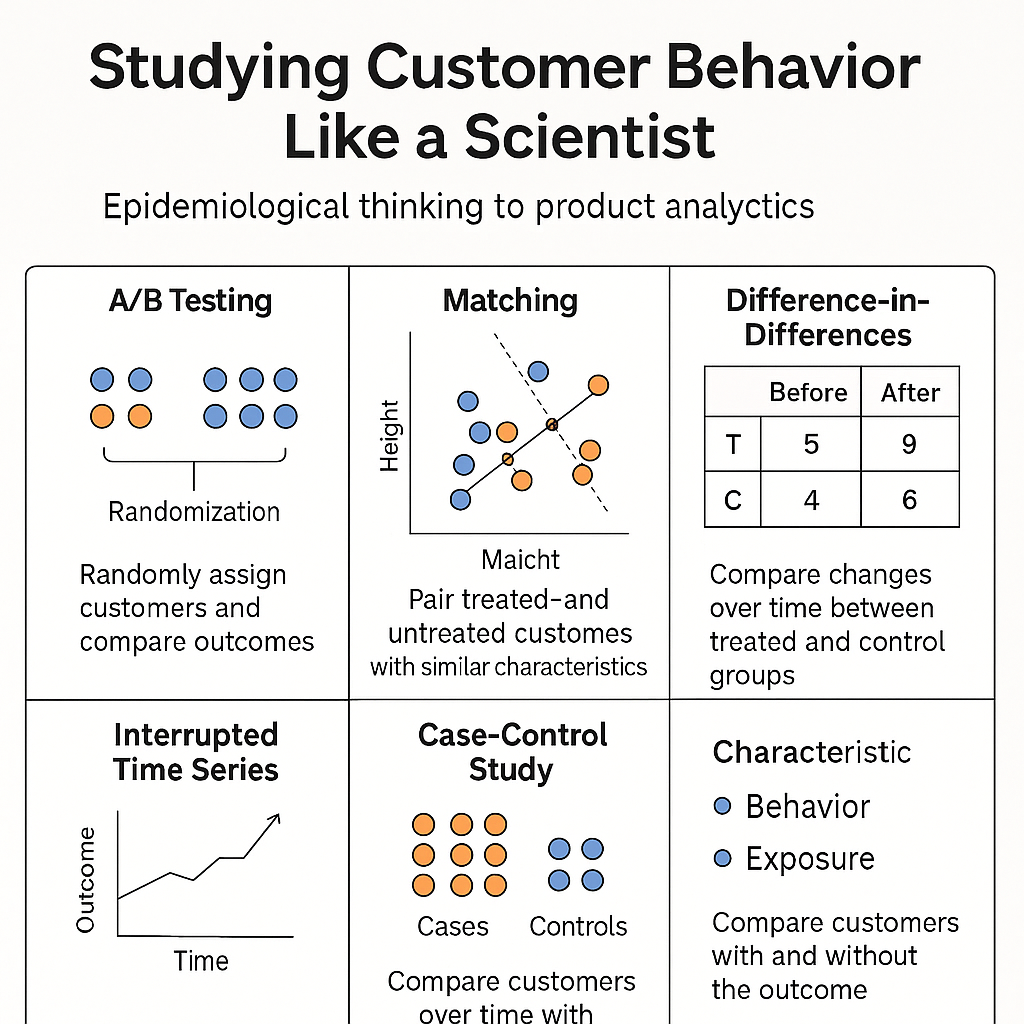
A/B Testing and Randomization: The Gold Standard
A/B testing (a randomized controlled trial) is the most reliable way to estimate causal effects. By randomly assigning users to different experiences, we ensure that, in expectation, both groups are equivalent across all variables—known and unknown.
This means any difference in outcomes can be attributed to the intervention itself.
Why It Works:
- Randomization eliminates confounding.
- Both observed and unobserved variables are balanced on average.
When A/B Tests Fail:
Randomization isn’t magic. Even randomized experiments can mislead when:
- Sample sizes are small, leading to imbalance by chance.
- Randomization units are incorrect (e.g., randomizing sessions instead of users).
- Dropout or attrition bias occurs if users exit differently across groups.
Randomization solves bias, not variance. You still need good measurement, sufficient power, and thoughtful design.
Visualization
| User ID | Group | Height (cm) | Weight (kg) |
|---|---|---|---|
| U1 | Treated | 170 | 70 |
| U2 | Control | 168 | 72 |
| U3 | Treated | 175 | 76 |
| U4 | Control | 160 | 50 |
In a well-randomized experiment, control and treatment users are distributed evenly across confounders like height and weight. In poorly randomized or small-sample tests, this balance can break down, distorting results.
When You Can’t Run an A/B Test: Observational Designs
Many real-world questions don’t allow for randomization. Maybe the feature already launched. Maybe legal or ethical reasons prevent it. Maybe you want to analyze historical behavior.
That’s where quasi-experimental designs come in. These methods, borrowed from epidemiology and econometrics, help estimate causal effects using observational data.
Here are four essential designs for product teams:
1. Matching
What it does: Pairs users who received an intervention (e.g., a new feature) with similar users who didn’t.
Why it works:
By matching on key characteristics (usage history, region, platform), we reduce selection bias and simulate the balance of an A/B test.
Example:
You want to know if enabling "scheduled delivery" improves retention. Early adopters might already be power users. You match treated users to similar untreated users based on past behavior and compare retention.
Matching simulates randomization when it isn’t possible.
Visualization (Nearest Neighbor Matching)
Treated and control users matched based on height and weight:
| Treated User | Height | Weight | Matched Control | Height | Weight |
|---|---|---|---|---|---|
| T1 | 170 | 70 | C1 | 169 | 68 |
| T2 | 165 | 65 | C2 | 166 | 66 |
| T3 | 180 | 85 | C3 | 179 | 83 |
Lines connect each treated user to their closest control in the confounder space.
2. Difference-in-Differences (DiD)
What it does: Compares behavior over time in a treatment group vs. a control group.
Why it works:
DiD controls for shared time trends by comparing the change in outcomes pre- and post-intervention between groups.
Example:
You launch a new checkout flow in Region A but not Region B. You compare the change in conversion in A vs. the change in B over the same time period.
If trends were parallel before, differences after suggest causality.
Visualization
Time →       | Before      | After
Region A     | 10% conv.   | 15% conv.
Region B     | 10% conv.   | 11% conv.
DiD Effect = (15 - 10) - (11 - 10) = +4%
3. Interrupted Time Series (ITS)
What it does: Analyzes changes in trend lines before and after an intervention within one group.
Why it works:
ITS uses longitudinal data to detect a structural shift after a known intervention. It’s great when no control group is available.
Example:
You change your pricing display on March 1. By modeling the trend in conversion before and after, you can test whether the change altered user behavior.
Strong ITS designs require stable trends and no overlapping changes.
Visualization
Date        | Conversion Rate
------------|------------------
Feb 25      | 10%
Feb 26      | 10%
Feb 27      | 10%
Mar 1 (UI)  | **12%**
Mar 2       | 13%
Mar 3       | 13%
A sudden and sustained jump on the intervention date suggests causality.
4. Case-Control Study
What it does: Works backward from an outcome to find behavioral or contextual differences.
Why it works:
This design identifies factors associated with outcomes when those outcomes are rare or retrospective analysis is needed.
Example:
You want to know what drives premium plan upgrades. You compare users who upgraded (cases) with those who didn’t (controls), then analyze differences in feature usage, support interactions, or campaign exposure.
Especially useful for post-hoc analysis or debugging user journeys.
Summary Table
| Study Design | What It Does | Best Used For |
|---|---|---|
| A/B Testing | Randomizes users into treatment/control | Clean causal inference when possible |
| Matching | Creates comparable treated/untreated users | Feature impact, observational settings |
| Difference-in-Differences | Compares trends across two groups over time | Rollouts across time or geography |
| Interrupted Time Series | Detects post-launch behavioral shifts | Time-based analysis without control group |
| Case-Control Study | Works backward from outcome to exposure | Behavioral root cause or rare outcome analysis |
Final Thoughts
Good analytics doesn’t just count events—it explains why things happen. Borrowing from epidemiology and causal inference gives product teams tools to move from correlation to causation.
When A/B testing isn’t feasible, methods like matching, DiD, and ITS let us estimate impact with care and credibility.
Behavioral analytics is not just descriptive. It can be scientific.
Want to bring causal rigor to your product analytics? Start designing studies like a scientist.